
Challenge: Design an album listening and ordering flow for your favorite band
Solution: An interface that visually organizes products and presents relevant ways to listen to an album and order products.
User Research
I conducted user interviews, which I then turned into empathy maps to better understand the target user and their needs. I discovered that many target users want to listen to an album before buying it, even if they are fans of the artist. User would also like inclusion within sizing of merchandise, as all sizing is not universal. To keep the experience enjoyable, I would like to make the check-out process user-friendly.
Persona

Kate
Age: 22
Education: BFA Painting
Hometown: Chicago, IL
Family: Single, lives alone
Occupation: Student/ Freelance Painter
Kate is a recent graduate with a BFA in Painting. She is currently a student, looking to obtain her MFA and does freelance painting in her free time. Kate loves music and tends to listen to it most when she is painting. She feels frustrated with complexities in design and being unable to listen to an album before her purchase.
Sam
Age: 34
Education: Marketing
Hometown: Chicago, IL
Family: Married, one child
Occupation: Digital Marketing Manager
Sam is currently working a full time job as a Digital Marketing Manager. He is married and has one child. Sam loves to support his favorite artists by listening to their music and wearing their merchandise. He feels frustrated with complexities in navigation and sizing of merchandise.

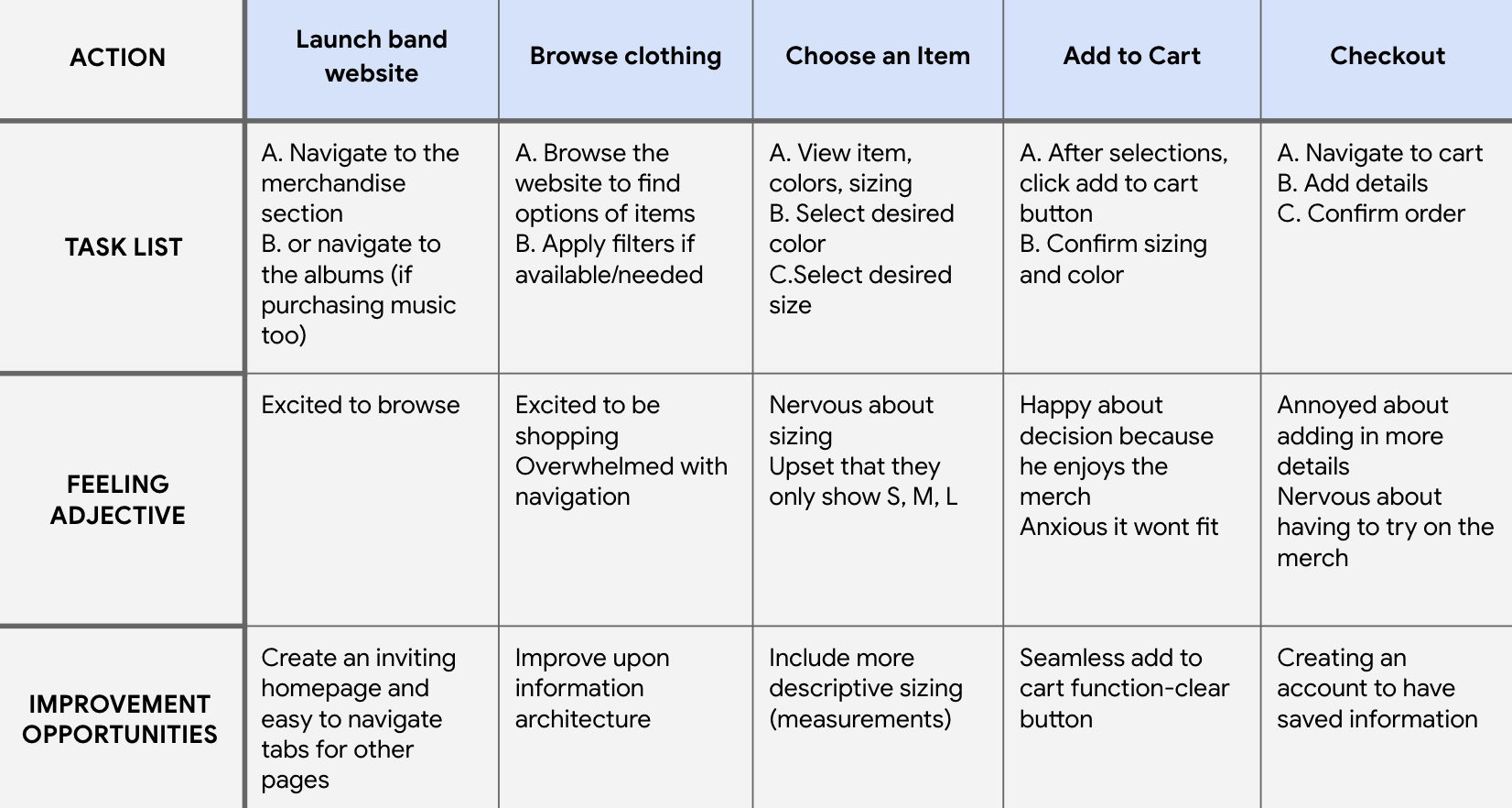
User Journey Map
My goals by creating this user journey map was to understand the process a user had to take from launching the website until after they checkout. I also wanted to be able to understanding their feelings and find areas of improvement.
Design Process
Sitemap
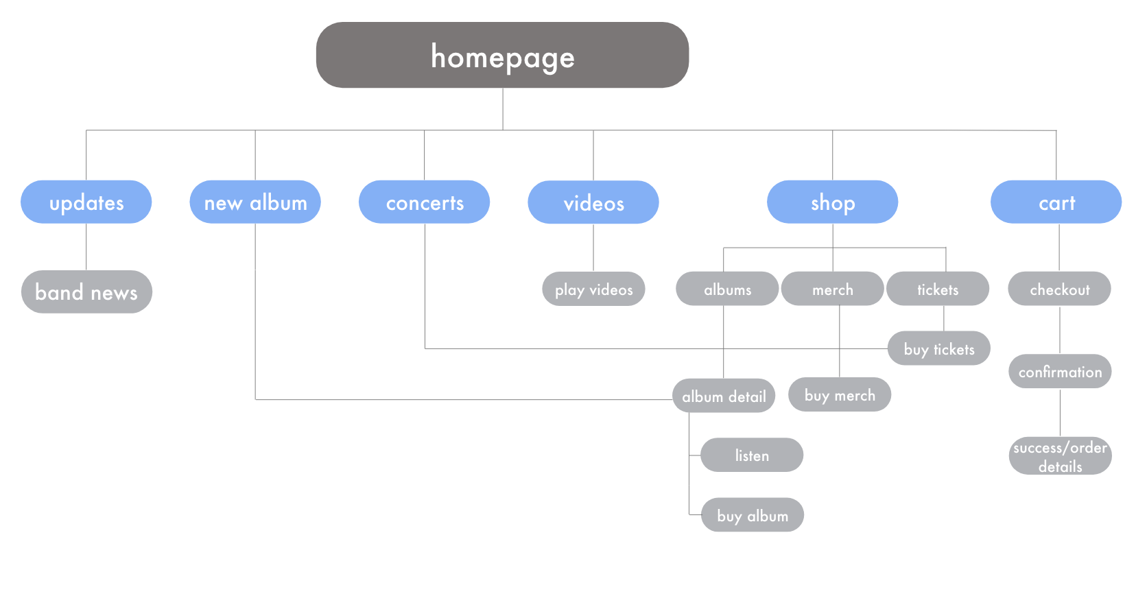
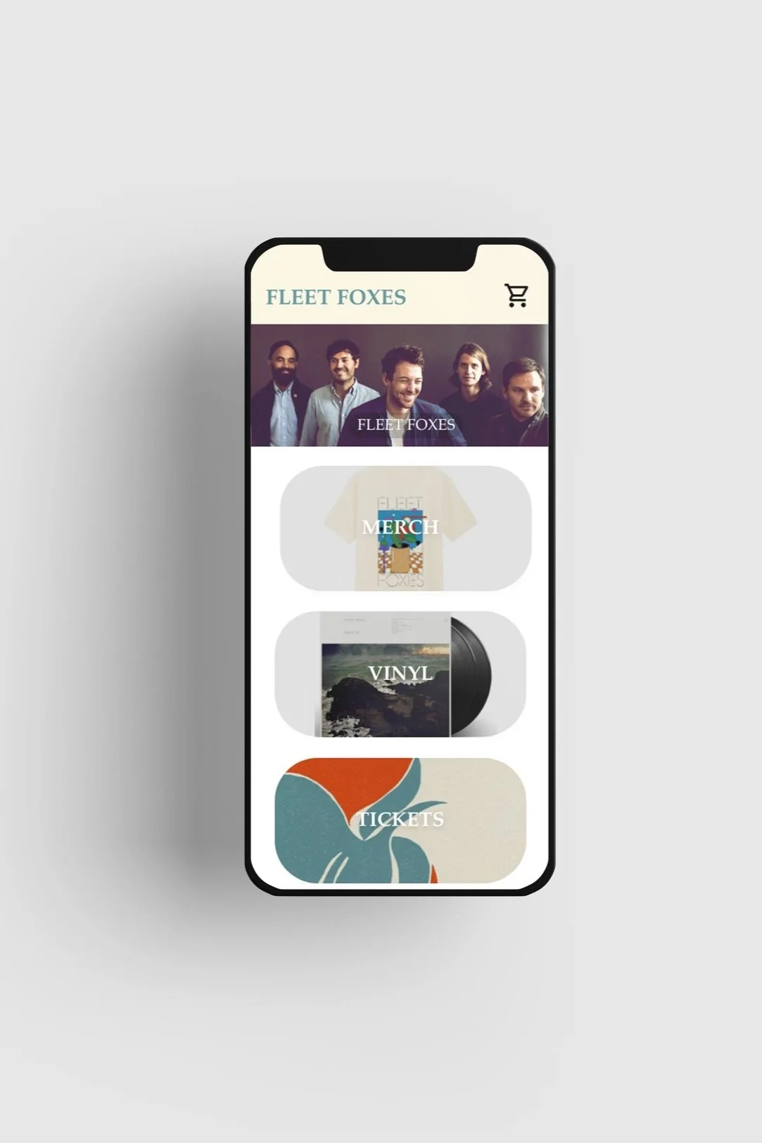
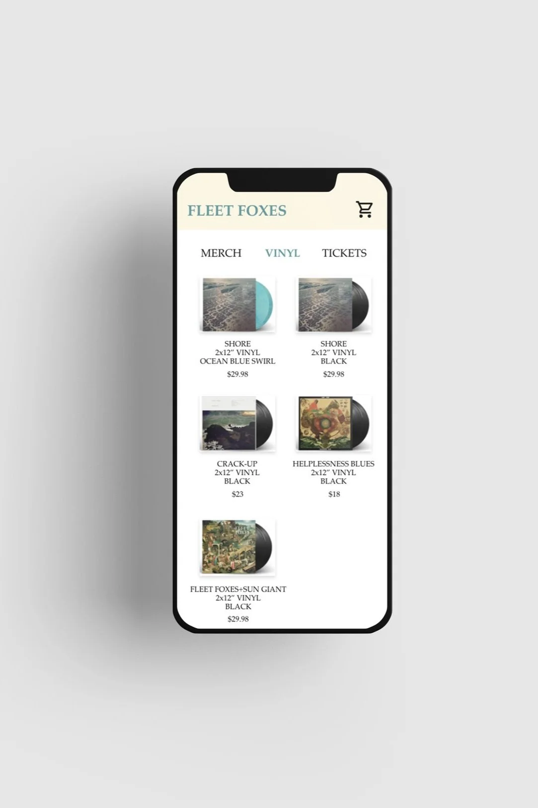
My goal was to make strategic information architecture decisions that would improve overall website navigation. The structure I chose was designed to make the user flow simple and easy.
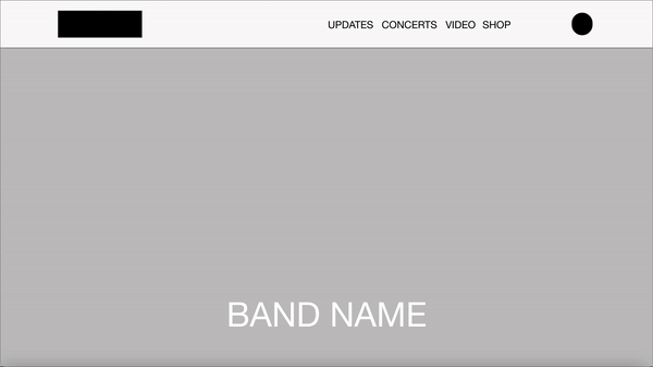
Wireframes
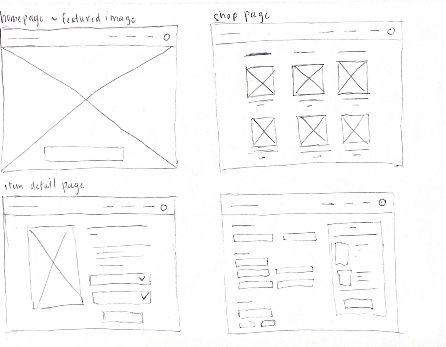
Wireframes solely for the desktop version.
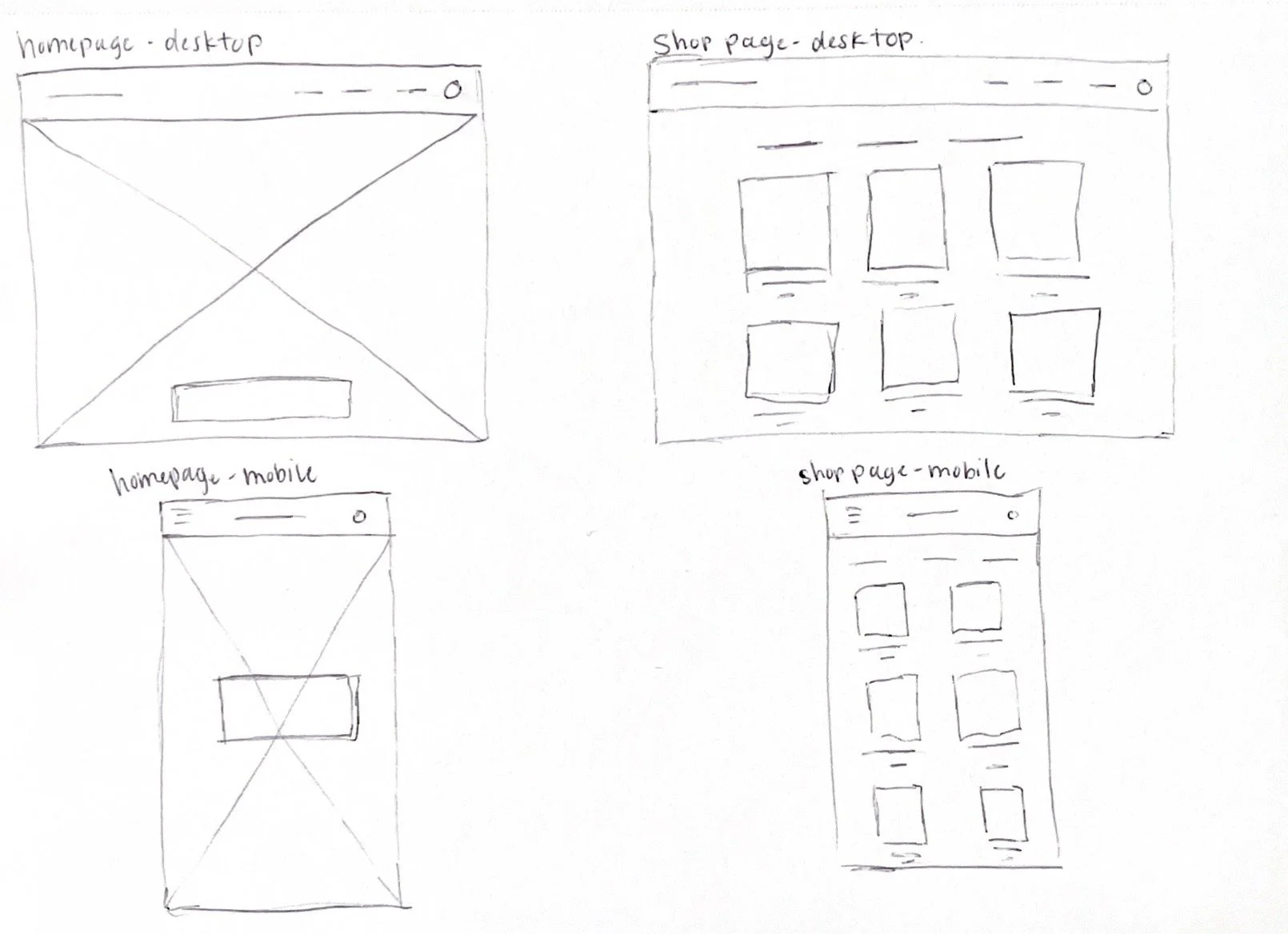
Wireframes showing responsiveness between the desktop and mobile website.
Usability Testing
Low-fidelity prototype
Unmoderated Usability Study
Prompt 1: Launch the website
Follow up question: How does the homepage make you feel?
Prompt 2: Navigate to the shop page and browse merchandise. Select one and add to your cart. Then go to your cart.
Follow up question: What was easy and what was challenging about the process?
Prompt 3: If I said “add an album to your cart”, would you know what to do? If so, could you please try that out for me?
Follow up question: Did you find anything confusing about that process?
Follow up question: Did you find it clear where to go if you were to listen to the album before your purchase?
Prompt 4: Navigate to your cart and complete the checkout process.
Follow up question: Was anything challenging about that process?
Prompt 5: How do you feel about the website overall? What did you like and dislike about it?
Findings
Users would like an easier way to go back to the page that they were on previously.
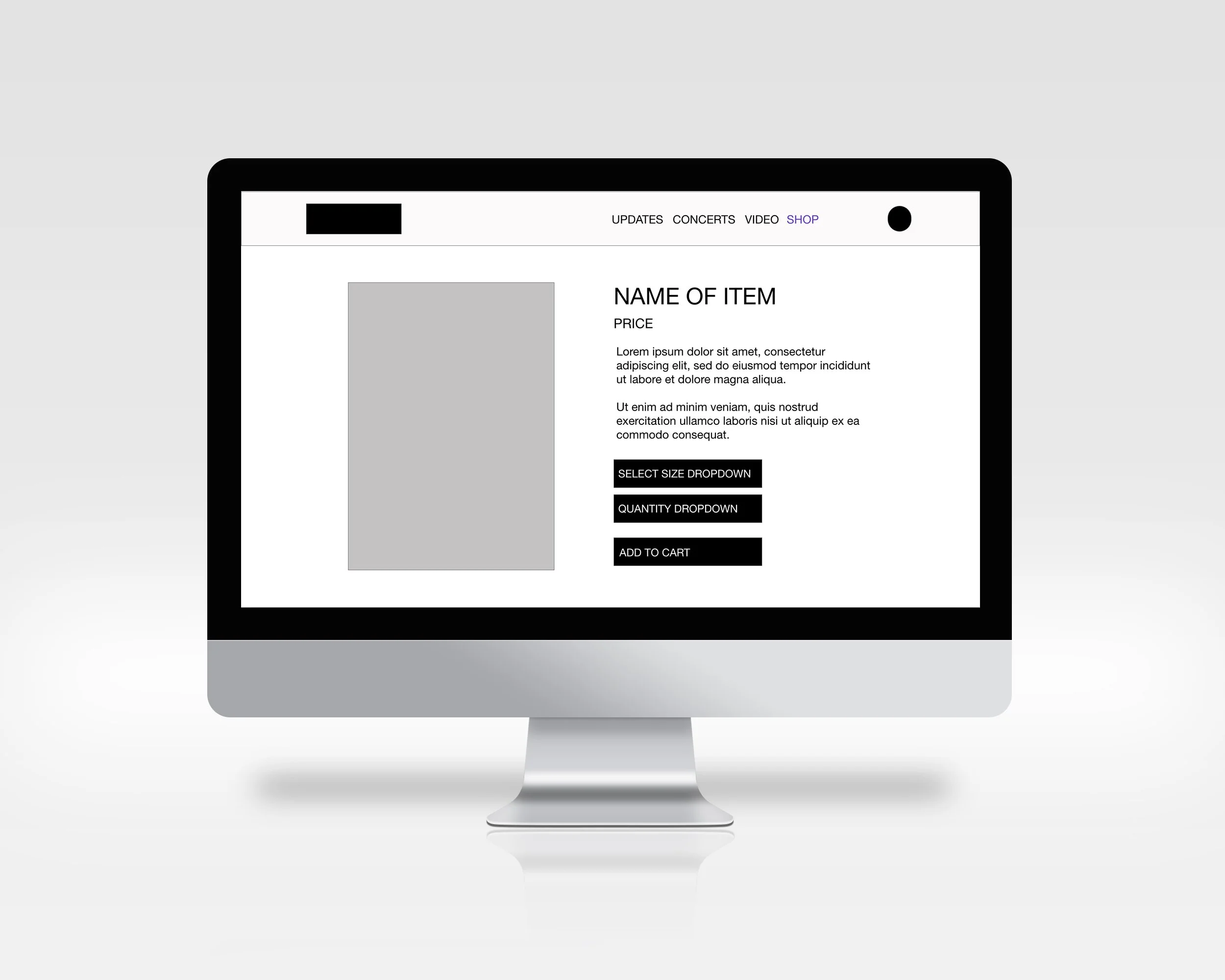
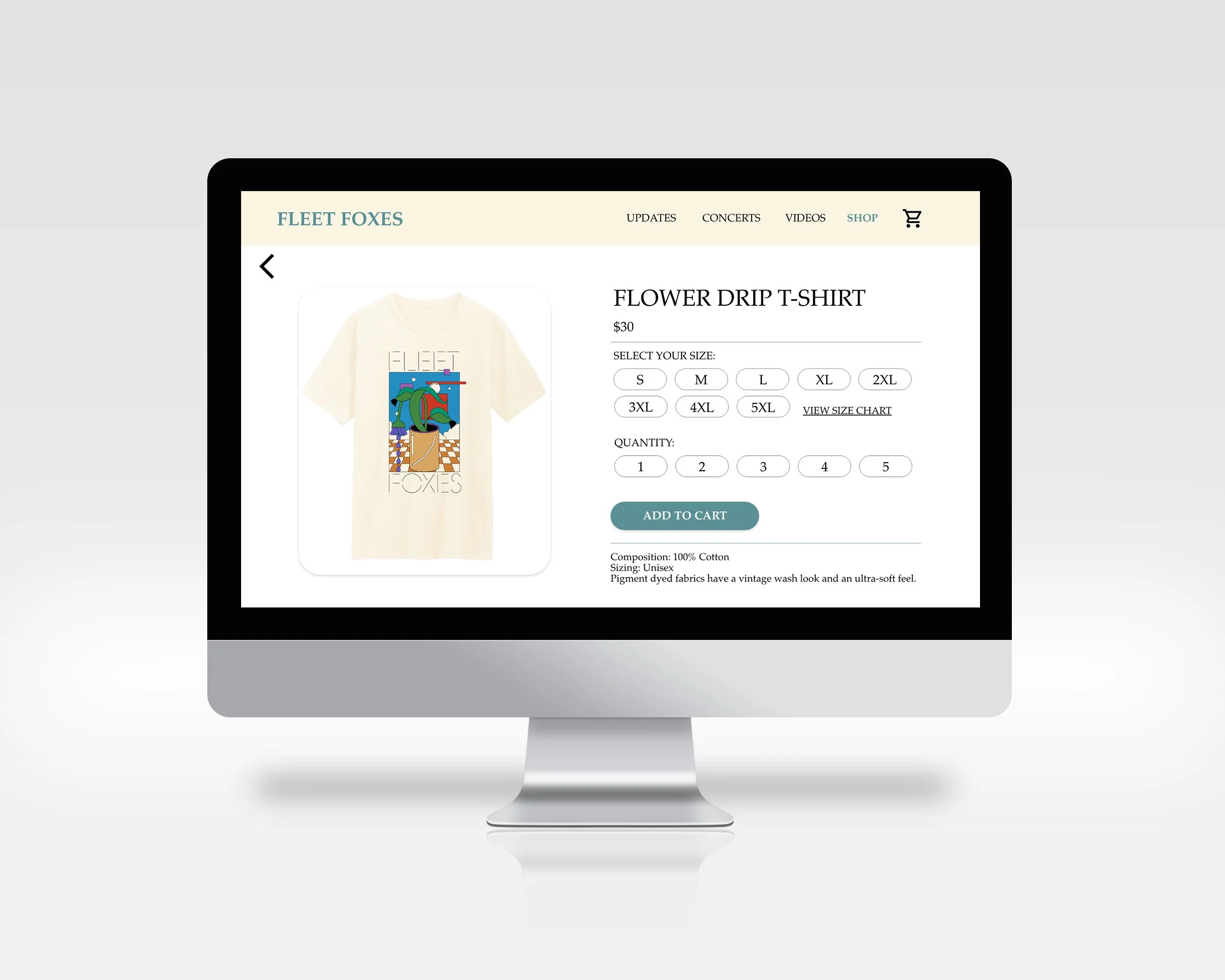
For the merch and album detail pages, users did not enjoy that there was a drop down menu to click size/quantity. They stated that they would like a better way to visualize that.
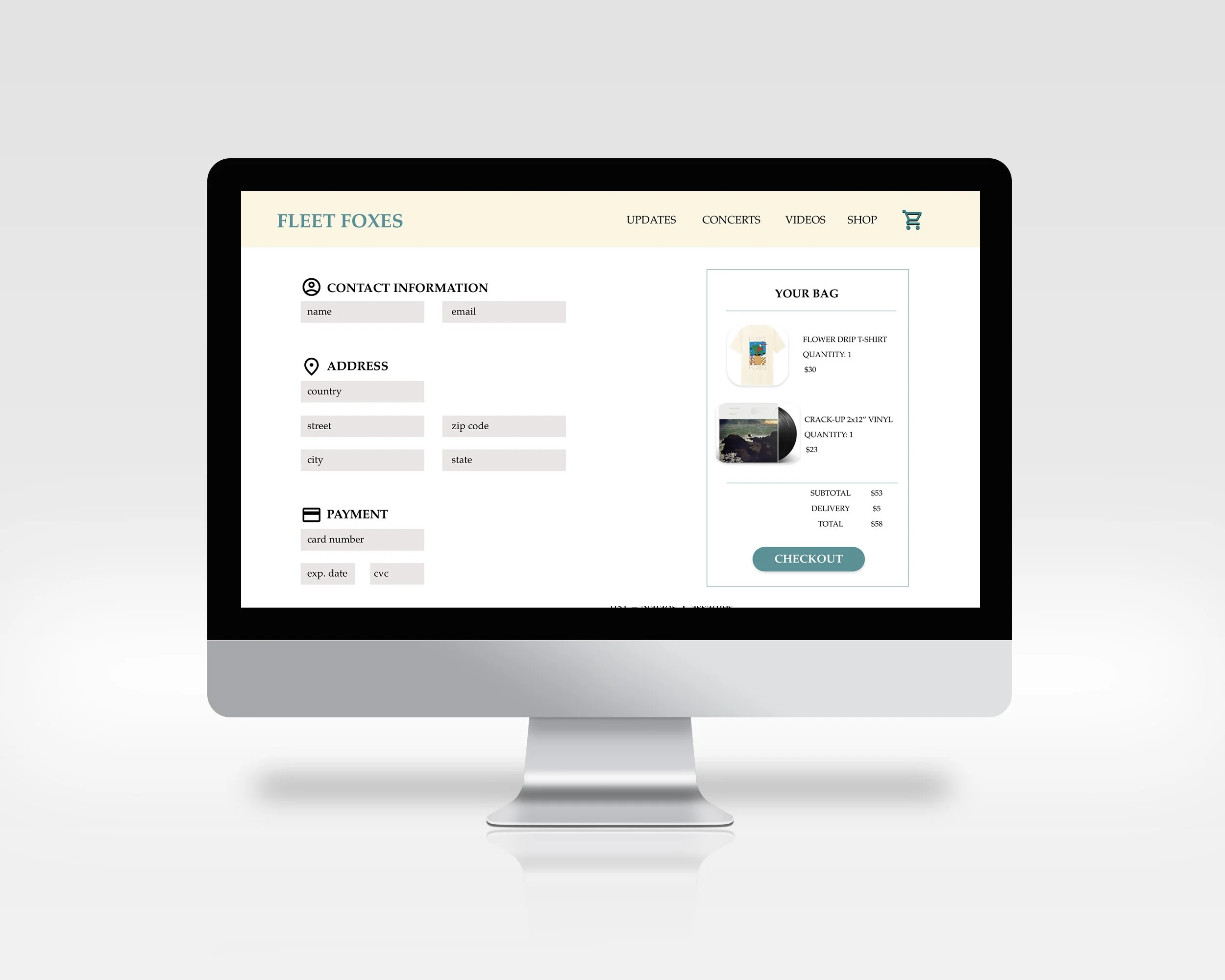
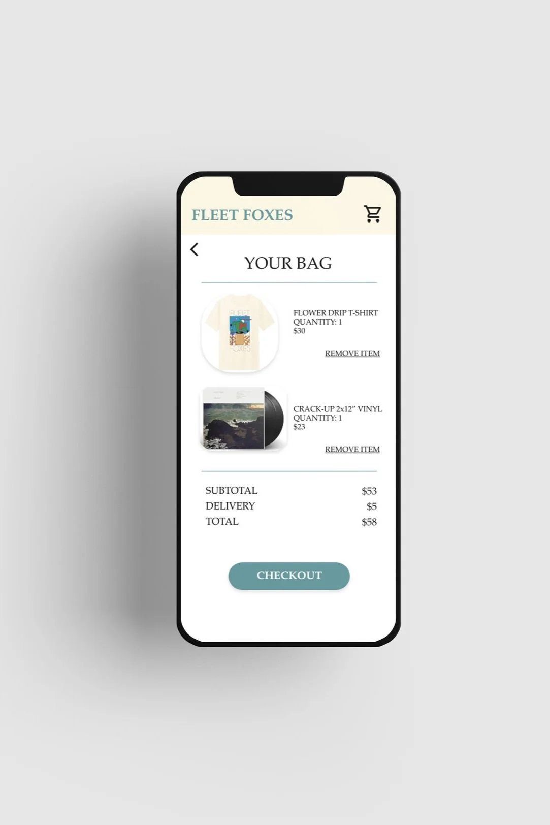
Users would like the option to view their cart before checking out. They felt as if the checkout flow was not seamless.
Final Iteration
Mockups
Before the usability study, I had drop down menus to select the size and quantity of the item. After the usability study, users stated that they wanted a better way to visualize their options. I created button options so they are able to view all of their options at once.
Before Usability Study
After Usability Study
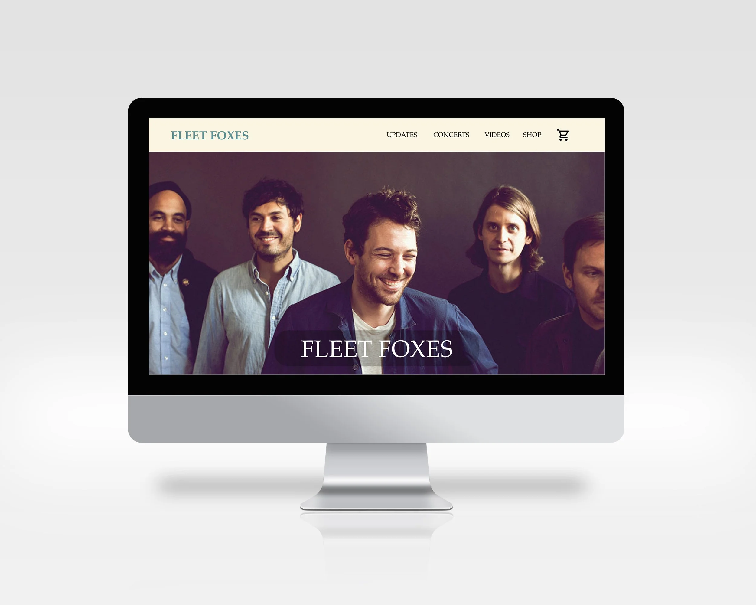


High-fidelity prototype