Challenge: Design a user experience to help save an endangered species of elephant.
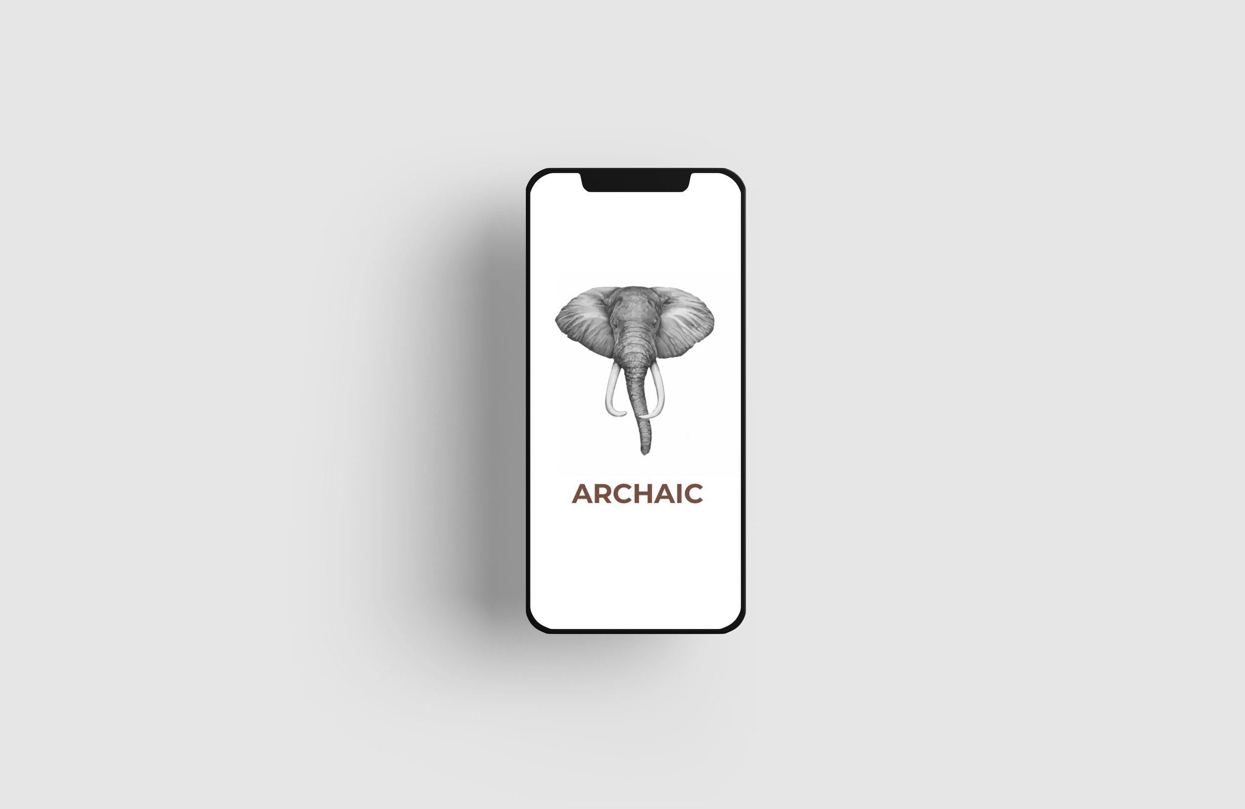
Solution: An interface that visually organizes data, and presents relevant information to get more communities educated and involved in the conservation of African Elephants.
Research
Research Goals
My research goals are to determine if users can complete core tasks within the prototype of this mobile app and responsive website.
Determine if the app is difficult to use.
Persona

Danielle
Age: 30
Education: Speech and Hearing Sciences
Hometown: Chicago, IL
Family: Lives with her dog
Occupation: Speech Therapist
Danielle is currently a Speech Therapist who lives and works in Chicago. In her free time, She loves to hike and take part in other outdoor activities. Though she is unsure where to start, Danielle is ready to take the next step to contribute to saving the wildlife.
Stan
Age: 72
Education: Law
Hometown: Chicago, IL / Naples, FL
Family: Married, 2 kids
Occupation: Retired
Stan is a retired lawyer. He is now enjoying his retirement in Naples, Florida with his spouse. He has a 2 children as well as 3 grandchildren. Stan has recently become more aware of endangered animals and is looking for ways that he can contribute.

User Journey Map
My goals by creating this user journey map was to understand the process a user had to take from launching the app and through the donation process. I also wanted to take a deeper look into understanding their feelings and find areas of improvement.

Design Process
Usability Testing
Low-fidelity prototype
Insights
Based on the theme users found navigation to be confusing, with no way of getting back to the home page until the very end, an insight is to rethink navigation and add buttons to get back to the previous page.
Based on the theme that participants users stated that there wasn’t enough context about the cause and where their money was going to, an insight is to add more detail, so they can find trust within Archaic.
Based on the theme that participants were confused about where their card information was being saved, an insight is to add a sign in option.
Final Iteration
Mockups
After the usability study, I changed the photo placement and also added a button to go back to the previous page. I made these changes based off feedback I got during the usability study.
Before Usability Study

After Usability Study

Before Usability Study

After Usability Study

Mockups
Users felt confused about the “Save” button when adding in their card information. After the usability study, I added their donation information and the option to change their card number.


High-fidelity prototype
Responsive Website
Alongside the mobile app, I created a responsive website for Archaic. In the mockup to the right, I show the donation confirmation page on a desktop as well as a mobile phone. My goal was to create a responsive website that offers different browsing experiences.
